Skip to content

Website Tips & Advice

How to Choose Website Colors

Good website colors should make your business feel recognizable, consistent, and easy to understand. You do not need a complicated palette. For most small businesses, the best place to start is with the colors customers already associate with the business—especially the colors in your logo and other established branding.

Start with your existing brand

Look at your logo, signs, uniforms, printed materials, packaging, vehicles, or other places your business already appears. If one color consistently represents the business, it is usually the strongest candidate for your primary website accent color.

That accent can help important parts of the website feel connected. The goal is not to make everything the same color. It is to create enough repetition that buttons, highlights, and other accents feel like they belong to the same business.

If your logo contains several colors, begin with the one that is most recognizable or most useful as an accent. Add another only when it has a clear purpose.

Open your website color settings

In your website editor, open Design and select Colors. This is where your website's saved Brand Colors can be reviewed and changed.


T 006 s1 ss1

Understand what your Brand Colors do

Your website already includes at least one saved Brand Color. Think of a Brand Color as a reusable accent color. Website elements that are connected to that Brand Color can update together when the saved color changes.

Before replacing the current color, look at your website and notice where that accent appears. This helps you judge the new color as part of the whole website rather than as an isolated color swatch.

Does it fit your logo?

A color already associated with your business usually produces a more natural, recognizable result than an unrelated color.

Does it attract attention?

An accent should help important items stand out without making every part of the page compete for attention.

Is it easy to read?

Always consider the colors around it. Text, buttons, and backgrounds need enough contrast to stay clear and comfortable to read.

Good rule: start with the color that already feels most like your business. You can refine the palette after you see how that color works across the actual website.

T 006 s2 ss1

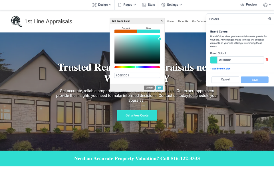
Change one Brand Color and preview the result

Once you know which color you want to test, select the existing Brand Color in the Colors panel. Choose the new color, then look at the website preview before deciding whether to keep it.

Select the Brand Color

Open the saved Brand Color you want to change.

Choose the new color

Use the color controls to select the color you want to test.

Preview the website

Scroll through the page and see how the new color works in the places where that Brand Color is being used.

What to look for in the preview

  • Does the color feel consistent with your logo and business identity?
  • Do important buttons or accents still stand out clearly?
  • Can text and other content still be read comfortably?
  • Does the color improve the page without becoming distracting?

If the result is not right, use Cancel to discard the change. When the color looks right, you can keep it with Save.

T 006 s3 ss1

Add another Brand Color only when you need one

If one accent color is enough for your website, there is no need to add more simply for variety. A smaller, more deliberate palette is usually easier to keep consistent.

When your branding genuinely uses another accent, the Colors panel also gives you the option to Add Brand Color. Once that color has been saved as a Brand Color, it can appear as a reusable choice while you edit text, buttons, colors, and other supported website items.

This is useful when you have a secondary brand color you expect to use repeatedly rather than choosing a slightly different shade every time you edit an element.

What the next screenshot shows: a saved Brand Color appearing inside another website color picker, making it easier to reuse the same approved color instead of selecting a new shade each time.

T 006 s4 ss1

Save your colors, then check the whole website

When you are satisfied with the Brand Colors, save your changes. Then look through more than one section of the website. A color that looks good in one place should still feel intentional when it appears elsewhere.

Quick website color check

  • Your main colors feel connected to your logo or established business branding.
  • Important actions are easy to notice without making the page feel overly bright or busy.
  • Text remains easy to read against its background.
  • Repeated accent colors look consistent from one section to another.
  • Every additional Brand Color has a reason to be part of the palette.

Common questions about website colors

Should my website colors match my logo?

Usually, yes. Your logo is one of the best starting points because it already represents your business. You do not have to use every logo color throughout the website.

How many Brand Colors should I add?

There is no need to add colors just to fill out a palette. Keep the group focused and add another Brand Color when you have a color you genuinely plan to reuse.

Why did several parts of my website change at once?

Elements that use the same Brand Color can update when that saved color changes. That is what helps a repeated accent stay consistent across the website.

Can I see the new color before keeping it?

Yes. After changing a Brand Color, scroll through the website preview. Use Cancel if you do not want the change, or Save when you are satisfied with it.

Keep making your website your own

Choosing the right colors is one part of building a website that feels unmistakably connected to your business. Continue with practical personalization ideas or use the Help Center when you need step-by-step editing guidance.

If the expected color controls are missing or your editor is not working normally, visit Website Technical Help.